What is negative space? A void? The lack of detail? Something we don’t pay attention to or value?
The correct answer is all of the above. Let’s take a look at how this plays out in our world and how we use negative space in design.
First, think of a letter. For younger folks, for whom a letter might be a somewhat old-fashioned method of communication, a formal email could be thought of in a similar fashion. Imagine you receive a letter with a sender’s address, date, salutation, body, closing and a signature. All this information is bordered with a margin of space. Space gives form to the individual words and the letter itself. Now, imagine the same letter with no space around the edges, no indent, no paragraph or spacing, just solid text from side to side and from top to bottom. You would not want to read such a letter. Space helps deliver information and gives form.

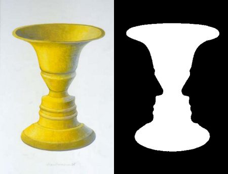
Remember the optical illusion of Rubin’s Vase developed by the Danish psychologist Edgar Rubin. How you look at the image will determine what you see – a face or a vase. Your brain is tasked with figuring out the depth and relationship of the images by using the objects, which surround and contrast each other.
There are other less obvious uses of negative space that are very important in our lives. For some, meditation allows space from the constant chatter of the mind. For others, it might be a quiet cup of coffee in the morning before the day starts. We use space in our lives to help give shape to the activities we find ourselves engaged in. The flip side of this would be a person’s life full of input. It would be like driving through a large city with lots of traffic, noise and distractions, without any break or space. You can do it, but only for a limited period of time before starting to lose your sanity. We need negative space to balance, to see and sense ourselves and our world.
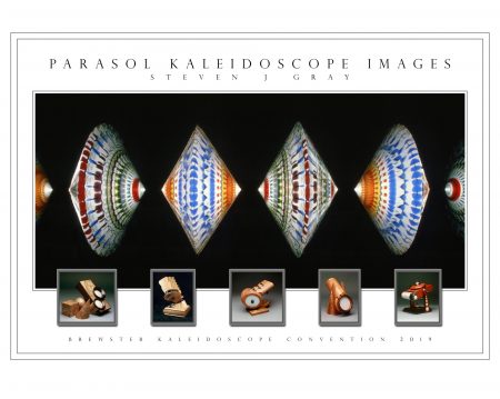
So, what does negative space have to do with kaleidoscopes? An image with a void helps to balance our visual  experience. Kaleidoscopic images can be intensified by a few techniques. Placing the image in the middle of a dark background or suspended in free space will transform the image, give emphasis and focus.
When a viewer’s eye can see a contrast between the image and background, amazing things happen. As the kaleidoscopic image and the viewer’s mind become one, we feel a sense of connection and oneness. Time stops, certain realities fade away and a person is enmeshed in a timeless quality of being that elicits a sense of awe.
We are blessed with such a powerful reality shifting tool.
Steven J. Gray
Steven Gray will be teaching a class at the upcoming Brewster Convention in June. Class details and outline are available on the kaleidoscope classes page.